

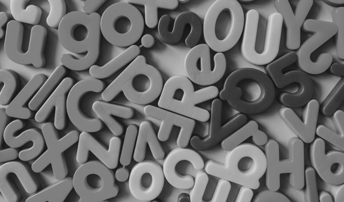
Typography plays a crucial role in design, influencing how we perceive and interact with visual content. Whether you’re a novice designer or someone with a keen eye for aesthetics, these five tips will help you identify good typography and enhance the overall visual appeal of your creations.
1. Readability Is Key
Good typography starts with readability. Choose fonts that are clear and legible, especially when it comes to body text. Avoid overly decorative or intricate fonts that may hinder the audience’s ability to comprehend the message. Aim for a harmonious balance between style and readability.
2. Consistency Matters
Consistency is the backbone of good typography. Stick to a limited number of typefaces throughout your design to create a cohesive and professional look. Ensure that headers, subheadings, and body text share a visual language, promoting a sense of unity in your design.
3. Mind the Hierarchy
Establish a clear hierarchy to guide the viewer’s eyes through the content. Use font sizes and weights strategically to emphasize important information. Headers should be noticeably larger than body text, creating a natural flow that makes the content easy to navigate and understand.
4. Pay Attention to Spacing
The spacing between letters (kerning) and lines (leading) significantly impacts the overall aesthetics of typography. Good typography involves balanced spacing that prevents letters from appearing cramped or too spread out. Optimal spacing contributes to a polished and visually pleasing design.
5. Consider Alignment
Align your text thoughtfully to maintain a clean and professional look. Whether you choose left, right, centre, or justified alignment, ensure consistency throughout your design. Avoid random shifts in alignment, as they can disrupt the visual flow and make the design appear disorganized.
Remember, good typography enhances the overall design experience, making it more accessible and visually appealing. By incorporating these tips, even novice designers or non-designer can elevate their understanding of typography and create visually stunning compositions. Happy designing!